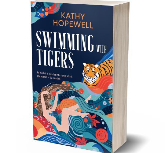
My soon-to-be-published novel, a historical recreation (with liberties taken) of women in the surrealist movement in the late 1930s, is called Swimming with Tigers. The title refers to a key scene in which my main character is at her lowest point and goes into the sea intending to end her life by drowning but a strange hallucination of a tiger swimming beside her gives her courage and inspiration. I had always hoped that there would be a tiger on the cover and that the orange of the tiger would be complemented by the blue of the sea. Although I would never wear it, I love the colour combination of orange and blue!
My vision for the cover
Throughout the writing process, the appearance of my book was both vague and clear: it was a tiger, it was swimming and there was a woman’s figure beside it. But that was it. How, then, could I bring this ghost of a visual idea into the world as a commercial, genre-specific, appealing book cover? I knew I would have to turn it over to someone who really knew her stuff: a gifted artist with a full working knowledge of current genre conventions and the technical specifications for uploading to digital and print platforms.
A drunken episode

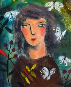
At a party, I had been drinking (to be fair, it was my birthday) and I turned to Susan Gathercole, a dear friend of mine who is a wonderful and successful fine art painter. She creates beautiful pictures of joy-infused still lifes and dreamlike figures in imaginary landscapes and I’ve loved her work for years. In my drunken state, I described my vision for my book cover and found myself asking her to paint it for me. She said yes! Then, when I sobered up, I remembered all the advice I’d heard: get a book designer to design your cover. My friend is an excellent visual artist — and a great reader — but I realised, sadly, that she wasn’t the right person for the job.
My artist friend, however, would certainly have done a better job than me because the very worst thing you can do as a writer is to try to design your own cover (unless, of course, you happen to be a book designer as well). It will look amateurish and a poor cover means poor sales. So I was left with a manuscript and the task of finding a book designer who could turn my idea into reality. I wanted her to honour my vision while at the same time adding some design magic and making sure it was recognisably a historical novel suggesting the theme of women as artists and friends and also with a nod to the 1930s setting.
Preparing to approach a designer
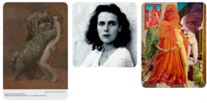
The first thing I did was make a shortlist of reputable book cover designers who were open to freelance work and to search for someone whose work I liked and that chimed, in some way, with the type and tone of the cover I wanted. Most designers have a website with examples of their work and often you can tell at a glance if they could be right for you and your book. Each designer will require specific types of information to work up a design from, but most will request examples of existing book covers you like and resemble what you are after, as well as covers you actively dislike and don’t want. I created a Pinterest board to bring together this information, adding book covers with the colourway and design ideas I liked. I also included more tangential material such as tiger pictures and some surrealist images from the period.


Subliminal messages
One of the great things about self-publishing is the high level of control that the author has over aspects such as cover design and marketing. This might lead an author to believe that their opinion of the cover design is the only one that counts. But if the designer is experienced and successful she will be aware of the current trends in the book’s genre and therefore arguably the better judge of the sort of cover that will best sell the book.
After all, can you, as a reader, articulate exactly what leads you to pick up one book rather than another on a table in a bookshop? As readers, we receive and recognise subliminal messages from the visual design of a book that help us choose one we will probably enjoy reading. We even register the genre of a book by visual cues without necessarily being aware of them. For example, certain fonts say fantasy, and black is commonly the colour used for crime novels; often the blacker the cover, the more explicitly violent the crime described. A designer, if she is worth her salt, will strive to match a book’s plot and writing style or mood with a cover that conveys these to a reader. If you request a pastel pink cover for a gritty crime novel then it’s the designer’s job to explain why this is a bad idea and your job to listen.
Positioning a book
Designers, however, don’t have time to read every book to the end before working on the cover so it will help if you can correctly identify the genre, and sub-genre (i.e. where your book sits within a genre) and convey this to them. Once you have settled on the broad genre (romance, historical, mystery, crime, etc.), a session spent studying recent covers of successful books in your genre will help you decide where to position it.
My novel is set in the late 1930s and early 1940s in Europe therefore my characters and plot are inevitably affected by the outbreak of World War 2 but my novel is not primarily about the war. So, even though readers who are keen on World War 2 fiction would enjoy it, my readership is mostly going to come from people interested in art history or readers of historical fiction about women. I would also like to signal that the book has literary qualities in terms of style and that it would appeal to readers of literary fiction. The crossover between literary and historical fiction is a rich area at present thanks to Hilary Mantel, Maggie O’Farrell and many others.

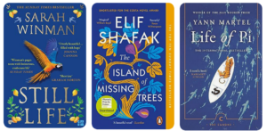
There is also at the moment a popular sub-genre of historical fiction about women’s experiences in World War 2, following the huge success of Kristin Hannah’s novel about a woman in the Resistance called The Nightingale and a rush of covers with a lone, turned-away female figure, sometimes with a bicycle, and the Eiffel Tower in the distance with a bomber plane going overhead. Because the war is not my central theme, I want to avoid any of these now-familiar visual cues on my cover. The closer comparison for me is a novel by Sarah Winman called Still Life which has a cover I adore, so I sent this, and some other decorative, vividly-coloured covers of historical/literary novels, as examples to my designer as well as asking her to please avoid including a lone woman standing next to the Eiffel Tower.
It’s not all about me!
I hoped that a cover designer could bring my fantasy to life but first and foremost a book cover is the packaging of a product. We authors have to love our covers, especially if we are indie authors who will have the job of selling our own books, but a professional designer will have a broader view of what works in the current market.
While it was legitimate and understandable to imagine my ideal cover, my advice to others would be to make sure that the fantasy doesn’t stop you from using good sense and judgment over the cover. You might love that picture of your dog or grandmother, you might really love the colour pink, or have an artist friend who is keen to have a go at it, but a professional designer can provide you with a cover that has all the visual codes and information that will entice the right readers to download it or pick it up from that bookshop table.
The result
The designer I hired was Jessica Bell, an author, musician and book designer much praised by the indie community for her vibrant and appealing covers.
What do you think of the cover she designed for me? Would you pick this up in a bookshop? I do hope so!


I think it is literally an outstanding cover – what is exactly what you want. It’s puzzling – bit of a tease – which draws one towards the book. The colouring is vivid, lively yet well-balanced. Terrific!
Thanks, Tim! I’ve had lots of very favourable reactions to the cover so far. It took a fair bit of to and fro with the designer to get it how I wanted, right down to choosing the best font out of half a dozen she sent me, but now I absolutely adore it!
The cover is both beautiful & intriguing.